Minimalist vs. Maximalist Logos: Which One Wins in 2026?

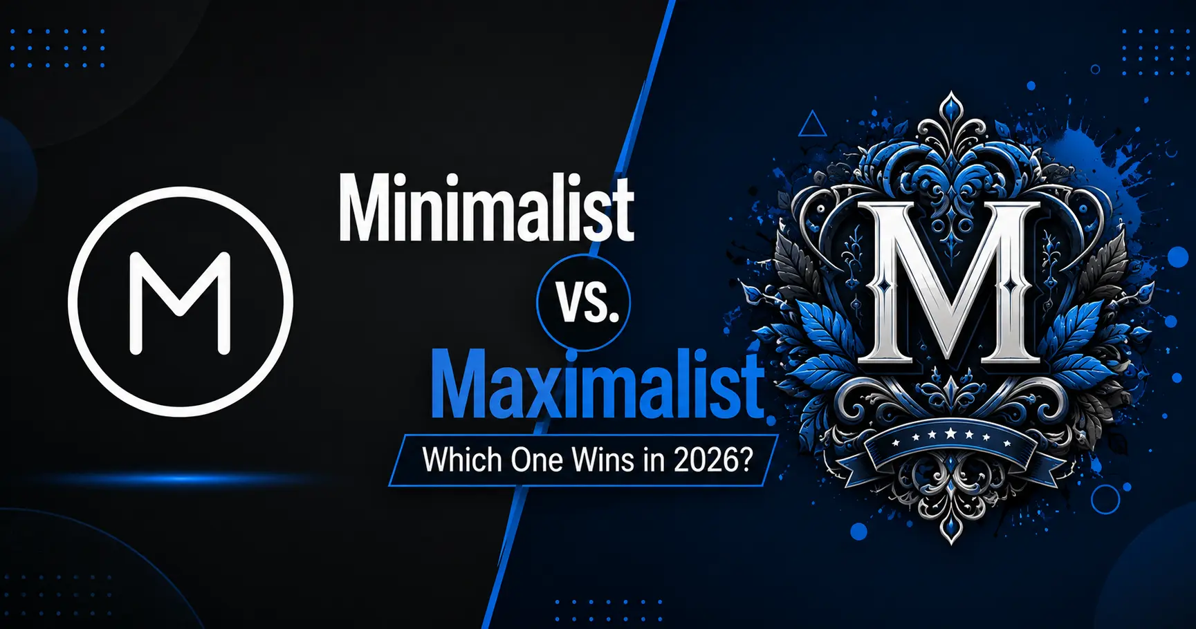
Minimalist vs. Maximalist Logos: Which One Wins in 2026?

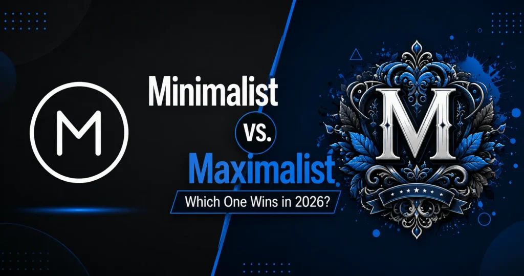
Every few years, design tastes swing hard in the opposite direction. For most of the 2010s, the safe choice was a flat icon, one or two colors, and a lowercase sans-serif wordmark. It worked, but it also made a lot of brands start to look the same. Now maximalism is having its moment layered textures, loud typography, illustrations with real personality. So which one is right for your brand?

That’s the wrong question, actually. The real question is: what does your logo need to do for your business? Minimalism and maximalism aren’t competing styles so much as different tools for different jobs. Let’s think through it together.

What Is Your Logo Actually Being Asked to Do?

Before picking a direction, ask yourself where this logo is going to live. Is it mostly going to appear as a tiny app icon and a favicon in a crowded browser tab? Or is it going to show up on packaging, merch, and large-format ads where it has room to breathe? That single question tells you more than any trend report will.

Why Minimalism Still Holds Up

Minimalism didn’t become popular because designers ran out of ideas  it became popular because it solves a real, unglamorous problem. A logo has to work everywhere, at every size, whether you like it or not.

Shrink a detailed illustrated mark down to a 32×32 favicon and it turns into mush. Shrink a simple geometric wordmark down to the same size and it’s still legible. That’s not really a design opinion, it’s just how pixels behave.

There’s also the recognition factor. Think about Nike’s swoosh, or Apple’s apple. Why do these work so well? Because there’s nothing competing for your eye. One shape, one read, done. If your brand needs people to recognize you instantly in a crowded app store or a busy Instagram feed, that kind of simplicity earns its keep.

And practically speaking, does your business have the time and budget to redesign your logo every few years? If not, simplicity ages better. You won’t find yourself stuck updating a texture or gradient every time it falls out of fashion.

Where does minimalism make the most sense? Generally for SaaS products, financial services, healthcare, and B2B brands anywhere the first job of the logo is to look credible before it looks interesting.

Why Maximalism Is Making a Real Comeback

But is “more” really such a bad thing? Maximalism, at its best, isn’t just adding more elements for the sake of it it’s a reaction to how similar everything started to feel. Scroll through a dozen startup logos from a few years back and half of them could swap names and nobody would notice. That sameness is exactly what maximalist branding is pushing back against.

A bold, hand-drawn, slightly imperfect mark tells the viewer something a flat icon can’t: that an actual person made a deliberate choice here, not a template. In a world where AI tools can generate a “clean logo” in ten seconds, that human fingerprint is starting to feel like a real advantage rather than a risk.

Maximalist logos also give a brand room to tell its story. A single icon can represent a category  a leaf for eco-friendly, a fork for food  but can it capture heritage, craft, or personality the way texture and illustration can? Usually not. If your brand’s whole pitch is “we’re different, we’re handmade, we have history,” a stripped-down icon might be underselling you.

And in a feed full of near-identical minimal logos, which one do you think earns the second glance? Usually the one with personality.

This direction tends to fit fashion, food and beverage, music, hospitality, and any brand selling an experience rather than pure efficiency.

Do You Really Have to Choose Just One?

Not necessarily. Some of the smartest brands right now aren’t picking a side at all they’re building two versions of the same identity. A simplified core mark handles the tight spaces: app icons, favicons, profile photos. A richer, more detailed version shows up wherever there’s room to breathe packaging, ads, merch.

It takes more work upfront, sure. But why sacrifice personality for usability, or usability for personality, when you can design for both from the very start?

So, Which One Is Right for You?

Before defaulting to whatever you saw trending this week, sit with a few honest questions. Where does this logo actually live day to day? What does your brand need to prove first  trust, or personality? And can you realistically commit to keeping it updated, given that maximalist styles tend to shift faster than minimalist ones?

There isn’t a universal winner here, and maybe there was never supposed to be one. The brands that get this wrong usually aren’t the ones who chose minimalism or maximalism they’re the ones who copied whatever was trending without asking what their logo actually needed to say.

Your brand has its own answer to that question. The only real job is figuring out what it is.