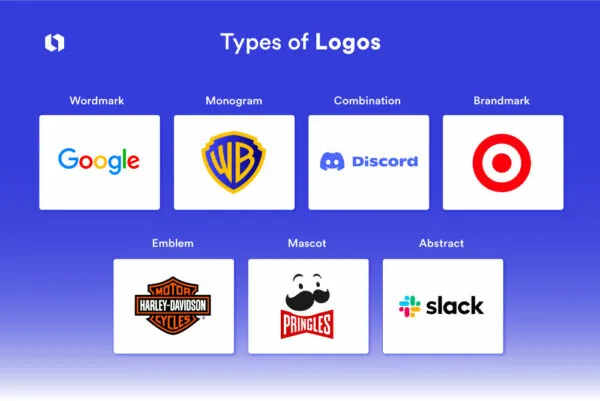
There are seven main logo types. Wordmarks use the full business name. Lettermarks use initials. Pictorial marks use a recognisable object. Abstract marks use a non-representational shape. Mascots use a character. Combination marks pair a symbol with the name. Emblems place the name inside a contained shape. The right choice depends on your name length, brand age, sector and where the logo will be used most.
Choosing a logo type is a practical decision, not a stylistic one. A twenty-two character business name will not work as a wordmark on a mobile app icon. A brand-new company cannot rely on a standalone abstract symbol that nobody recognises yet. This guide covers each type, its real strengths, its failure modes, and the situations where it is the right call.
- Combination marks are the safest default for new businesses, because they work as a pair and split apart later.
- Standalone symbols require recognition you have not built yet. Earn the right to drop your name.
- Long business names push you toward lettermarks or stacked combination lockups.
- Emblems look premium and fail at small sizes more often than any other type.
- Your logo type decision should be driven by where the mark will appear most, not by what looks best in a presentation.
1. Wordmark (logotype)
What it is: The business name set in custom or carefully selected typography, with no accompanying symbol. Google, Coca-Cola, FedEx and Visa are wordmarks.
When it fits:
- Your name is short, distinctive and pronounceable, ideally under twelve characters
- You are a new business that needs name recognition before symbol recognition
- Your name is the differentiator, particularly for founder-named professional services
Where it fails: Long or generic names. “Midlands Commercial Cleaning Solutions” as a wordmark is a paragraph, not a mark. Wordmarks also struggle as app icons and social avatars because there is no compact version to fall back on.
Design note: A wordmark lives or dies on letterform craft. Setting your name in an off-the-shelf typeface with default spacing is not a wordmark, it is typed text. The value comes from customised letterforms, corrected kerning and a proprietary detail that makes the word ownable.
2. Lettermark (monogram)
What it is: A mark built from initials. IBM, HBO, CNN and HP are lettermarks.
When it fits:
- Your legal name is long and your customers already shorten it
- You operate in a formal sector where initials read as established, such as law, finance, insurance or institutions
- You need extreme compactness for small applications
Where it fails: Recognition. A new company using three initials that mean nothing to the market is asking customers to learn an abbreviation before they have learned the business. Initials are also collision-prone, so trademark clearance is harder.
Design note: Two or three letters is the workable range. Four starts to read as a code. Interlocking or ligature treatments make a lettermark ownable, which matters because plain initials in a common typeface are weakly distinctive.
Wordmark or lettermark: which one?
The difference is simply full name against initials. Coca-Cola is a wordmark, IBM is a lettermark. Choose on two factors. First, length: if your name runs past roughly fifteen characters, a wordmark becomes unreadable at small sizes and initials solve it. Second, what your customers already say: if people already shorten your name in conversation and email, the market has made the decision for you. If they do not, introducing initials means teaching an abbreviation nobody is asking for.
3. Pictorial mark (brand mark)
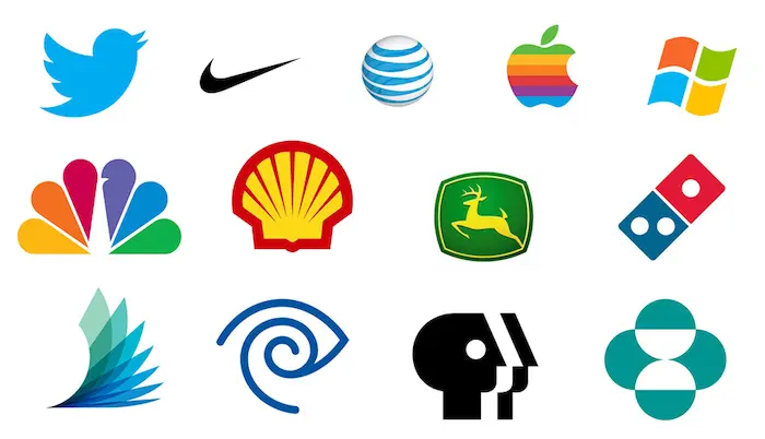
What it is: A recognisable, representational image used as the identifier. The Apple apple, the Twitter bird as it was, the Shell pecten and the WWF panda are pictorial marks.
When it fits:
- The image has a natural link to the name, the origin story or the product
- You want an asset that crosses language barriers
- You will invest in enough exposure for the symbol to become associated with you
Where it fails: Category clichés. A globe, a leaf, a handshake, a lightbulb or a rocket has been used thousands of times in every sector. These are hard to register as trademarks and impossible to own in the customer’s mind.
Design note: Pictorial marks are also constraining. If the image describes what you do today, it may not fit what you do in five years. A pizza slice icon becomes a liability when the business expands into catering.
4. Abstract mark
What it is: A geometric or non-representational symbol that does not depict a literal object. The Nike swoosh, the Adidas three stripes, the Pepsi globe and the Chase octagon are abstract marks.
When it fits:
- Your business spans multiple products or categories that no single image can represent
- You want maximum flexibility of meaning
- You have the marketing budget to build the association
Where it fails: In isolation, for young brands. An abstract shape carries no inherent meaning, so all of its meaning has to be supplied by exposure. If you cannot fund that exposure, you have a shape nobody can connect to your business.
Design note: Abstract marks are the strongest trademark category because they are inherently distinctive. They are also the hardest to get right, because there is no reference to anchor the form. Weak abstract marks look like generic swooshes and spirals, which is exactly the trap most template logo generators fall into.
Pictorial or abstract: which one?
A pictorial mark depicts something real, like an apple or a bird. An abstract mark depicts nothing, like the Nike swoosh. The trade is meaning against flexibility. A pictorial mark arrives with meaning already attached, which helps a young brand but pins it to one idea. An abstract mark arrives empty, which costs you exposure to fill but never constrains what you sell. If you operate in one clear category and need to be understood quickly, go pictorial. If you span categories or expect to, go abstract.
5. Mascot
What it is: An illustrated character that represents the brand. The Michelin Man, the KFC Colonel and Mailchimp’s Freddie are mascots.
When it fits:
- Family, sport, food service, entertainment and local businesses
- Brands built on approachability and personality
- Businesses that need a flexible asset for advertising, packaging and social content
Where it fails: Professional and premium positioning. A mascot on a law firm or a private bank undercuts the seriousness the audience is looking for. Mascots also cost more over time, because a character needs multiple poses and expressions to stay useful.
Design note: A mascot is rarely the logo on its own. Most mascot brands run a simplified wordmark or combination lockup as the working identifier and use the character in campaigns. Detailed illustrated characters do not survive at small sizes.
6. Combination mark
What it is: A symbol and the business name locked together, designed to work as a unit and to separate when needed. Burger King, Doritos, Lacoste and most modern corporate identities are combination marks.
When it fits:
- Almost every new business. This is the default recommendation for good reason.
- You need name recognition now and symbol recognition later
- You need one asset that covers a website header, a signboard, a social avatar and an app icon
Where it fails: Rarely on function, sometimes on discipline. Combination marks fail when the two parts are not designed to a shared system, so the symbol looks bolted on. They also fail when no separated icon version is delivered, which leaves you stretching a horizontal lockup into a square avatar.
Design note: Build the symbol so it can stand alone from day one, then keep the name attached until recognition is established. This is the path most large brands took, including Nike, which used the swoosh with its wordmark for over two decades before dropping the name.
7. Emblem
What it is: The name contained inside a shape, so the type and the symbol are inseparable. University crests, Harley-Davidson, Starbucks in its earlier forms and most police and sports insignia are emblems.
When it fits:
- Heritage, craft and institutional positioning
- Sports clubs, schools, breweries, coffee, apparel and hospitality
- Applications where a badge form is natural, such as embroidery, packaging and signage
Where it fails: Small sizes and digital use, more than any other type. Emblems pack type inside a shape, so shrinking the shape shrinks the type below legibility. On a favicon, most emblems become a grey circle.
Design note: If you choose an emblem, budget for a simplified variant from the start: usually the central symbol alone, or a reduced badge with the fine detail removed. Several heritage brands have simplified their emblems specifically to survive digital use.
Which type should you choose?
Work through these questions in order.
- How long is your business name? Over fifteen characters pushes you away from a pure wordmark and toward a lettermark or a stacked combination mark.
- How well known are you? Low recognition means keep the name in the mark. A standalone symbol is something you earn.
- Where will the logo appear most? If the answer is app icons, social avatars and small print, avoid emblems and detailed mascots.
- What does your category expect, and do you want to meet or break that expectation? Emblems read as heritage. Abstract marks read as modern and corporate. Mascots read as friendly.
- What might you sell in five years? Literal pictorial marks constrain expansion.
For the majority of small and mid-sized businesses, the answer lands on a combination mark with a properly designed standalone icon. It is the only type that covers every application without compromise, and it leaves the door open to simplify later.
Which logo type works best for app icons and avatars?
A standalone symbol, either pictorial or abstract, or a single-letter lettermark. These are the only forms that hold up inside a small square or circle. Emblems and long wordmarks perform worst, because both pack type into a space that is about to be reduced. If a significant share of your customer contact happens through an app, a social profile or a browser tab, let that constraint lead the decision rather than treating it as an afterthought.
Can you change logo type later?
Yes, and the common path is well worn: start with a combination mark, then drop the name once the symbol carries recognition on its own. Nike ran the swoosh alongside its wordmark for over two decades before separating them, and Mastercard removed its name from the mark only in 2019, after decades of exposure.
The mistake is doing this by drift rather than decision. If the icon-only version starts appearing in some places and the full lockup in others because nobody defined the rules, you are not evolving the identity, you are diluting it. Set the conditions in advance: what has to be true about recognition before the name comes off.
Not sure which type fits your business? That decision should come out of your name, your sector and your application list, not a template. Get a recommendation from our design team, or see examples of each type in our portfolio.