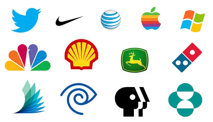
Simple logos win because they are recalled more accurately, reproduce reliably in every format, cost less to apply, and do not depend on a joke that stops working. Clever concepts are memorable in a pitch meeting and fragile in the field. The strongest marks are simple in form and, occasionally, clever underneath.
Every designer has sat in a presentation where the clever concept gets the loudest reaction. The symbol that hides a second meaning, the letterform that doubles as an object, the visual pun that makes the room lean forward. Then the mark goes into production, gets stitched onto a shirt, shrunk to a favicon and printed in one colour, and the cleverness quietly disappears.
This is not an argument against ideas. It is an argument about where the idea should live.
- Simplicity is a manufacturing and recall requirement, not a trend.
- A concept that needs explaining is a concept the customer will never receive.
- Simple does not mean generic. The test is whether the silhouette is ownable.
- Clever works when it is a reward for close attention, not a requirement for basic comprehension.
- Most redesigns of the last thirty years have moved in one direction: toward reduction.
Simplicity is a production requirement first
The reason logos have simplified over the past century has less to do with taste than with the number of surfaces a mark now has to survive.
A logo designed in 1960 needed to work in print, on signage and on a vehicle. A logo designed today needs to work as a 16 pixel favicon, a circular social avatar, an app icon with a rounded mask, an embroidered patch, a laser engraving, a single colour stamp, a dark mode header, a video watermark and an animated intro.
Detail does not survive that range. Fine lines drop out in embroidery and small print. Gradients band on cheap printing and disappear in single colour. Tight counters fill in when the mark is reduced. Text inside a symbol becomes illegible below a certain size. Every element you add to a mark is an element that has to hold up across all of those contexts, and most do not.
Why are so many logos simple now?
Because the number of surfaces has multiplied, not because of a style shift. A mark that once needed to work in three places now needs to work in fifteen, several of which are smaller and lower fidelity than anything that existed before. Reduction is what happens when a design meets that range of real-world application. The brands simplifying their marks are not chasing minimalism, they are removing the elements that were already failing in production.
Simplicity is a memory requirement second
Recognition is the point of a logo, and human memory for images is far coarser than people assume. Ask someone to draw a logo they see daily and what comes back is a rough shape, a dominant colour and one or two structural relationships. The detail is gone.
Since the customer is only ever storing the simplified version, you may as well design the simplified version. A complex mark does not get remembered in full. It gets remembered as an approximation, and if that approximation is generic, you have lost the distinctiveness you paid for.
This is also why the squint test remains the most useful ten second evaluation available. Blur the mark until detail disappears. What remains is roughly what the customer retains.
The clever trap
Cleverness fails logos in five specific ways.
It depends on being explained. If the concept has to be described before it lands, the customer will never receive it. Nobody reads your rationale document. They see the mark for a fraction of a second on a shelf or in a feed.
It stops being clever on the second viewing. A visual pun delivers its payload once. After that, the mark has to work as a mark. Novelty is a poor foundation for something you will use for a decade.
It ties the brand to a specific meaning. A symbol that cleverly encodes what you sell today becomes a constraint when you expand. Businesses change their offering more often than they change their logo.
It usually adds complexity. Encoding a second meaning normally requires more elements, and more elements break the production requirement above.
It travels badly. Puns, cultural references and language-dependent constructions do not survive export to another market. A mark that reads as a witty double meaning in English can be meaningless or unfortunate elsewhere.
Where cleverness does belong
The good version of clever is a mark that works completely as a simple shape and contains an additional layer for anyone who looks twice.
The FedEx arrow is the standard reference. The wordmark functions as a plain, legible wordmark. Nobody needs to see the arrow formed between the E and the x for the logo to do its job. When they do notice it, it produces a small moment of satisfaction and a memory hook. The cleverness is a bonus layer, not a load-bearing one.
The test is simple. Remove the clever layer entirely. If the mark still works, the cleverness has earned its place. If the mark collapses without it, you have a puzzle rather than a logo.
Should your logo have a hidden meaning?
Only if it works completely without one. A hidden layer is a bonus for the viewer who looks twice, and most people never will. Design for the person glancing at your mark for half a second in a search result, then add the second layer for the person who studies it. Reverse that order and you have built a puzzle that fails the majority of the audience.
This layered approach is closely related to negative space technique, which we cover in negative space in logo design.
Simple is not the same as generic
This is the failure mode on the other side, and it is a real risk. Reduction can strip a mark past the point of distinctiveness.
Two circles and a sans serif typeface is simple. It is also indistinguishable from thousands of other marks and difficult to register as a trademark. The wave of near-identical geometric sans serif rebrands over the past decade is what happens when simplicity is pursued without distinctiveness.
The correct target is the smallest number of elements that still produces an ownable shape. That means:
- Check the silhouette. Fill the mark solid black. Is the outline still recognisably yours?
- Check it against the category. Line it up with twelve competitor logos. If it disappears into the row, you have reduced too far.
- Keep one deliberate asymmetry or proprietary detail. A single distinctive relationship, a custom letterform, an unusual proportion, is often what separates ownable from generic.
Simplicity without distinctiveness is not minimalism. It is just an absence of decisions.
Does a simple logo look cheap?
Not when it is well made, though a badly made one looks cheaper than a badly made complex one, because there is nothing to hide behind. Perceived quality in a reduced mark comes entirely from precision: spacing, proportion, curve quality, optical balance and letterform detail. Those are exactly the things a template generator cannot do and exactly the things a client cannot see in a presentation but can feel. If a simple mark looks cheap, the problem is craft, not simplicity.
What actually makes a logo timeless
Timelessness comes from structure rather than surface. Proportion, balance, counter shapes and the relationships between letterforms age well because they are not tied to any period. Effects, textures and trend typefaces do not, because they are.
The practical version of this: if you can describe what makes your logo current, it will date. Heavy bevels described the early 2000s. Long shadows described 2013. Gradient blobs described the late 2010s. Each was the obvious choice at the time.
This is also why the right maintenance rhythm is refinement rather than replacement. Small evolutionary adjustments every five to ten years keep a mark current without resetting recognition. A full redesign throws away the association you have been paying to build, which is only worth doing when the business itself has genuinely changed.
What this means for your logo
If you are commissioning or reviewing a logo, apply these four filters before you approve anything.
- Reproduce it at 16 pixels. If it is unreadable, it will fail as a favicon and an app icon regardless of how good it looks at presentation size.
- Convert it to pure black on white. Colour and gradient hide structural weakness. Removing them shows you what you actually have.
- Count the elements. For each one, ask what job it does. Any element without an answer should be removed.
- Explain the mark in one sentence, then remove the explanation. Show the logo to someone who has not heard the rationale. Their first reaction is the real one.
A logo that passes all four will still be usable in ten years, which is the only meaningful measure. The mark that got the biggest reaction in the meeting is very often not the mark that survives the decade.
If your logo fails the black and white test or the 16 pixel test, the fix is usually a structural simplification rather than a full redesign, and it preserves the recognition you have already built. See our logo redesign and refinement service or contact the team for a review of your current mark.