A good logo is distinctive, simple, scalable, appropriate to its audience, and durable enough to survive a decade of use. Everything else, including colour, cleverness and current trends, is secondary. If a mark fails any one of these five traits, it will cost the business money in reproduction, recognition or redesign.
Most logos that get rejected by a client are not rejected for being ugly. They are rejected because nobody can say what the mark is doing for the business. This guide gives you the five traits we assess against at Professional Logo Design, the reasoning behind each one, and five tests you can run on your own mark before you commit to it.
- Distinctiveness matters more than beauty. A logo’s job is identification first.
- Simplicity is a functional requirement, not an aesthetic preference. It drives recall and reproduction.
- If a mark fails at 16 pixels, it fails as a favicon, an app icon and a social avatar.
- Appropriateness is judged against the competitive set, not in isolation.
- A logo that needs a paragraph of explanation is a concept, not an identity.
1. Distinctive: it can only be your business
Distinctiveness is the trait that does the actual work of a logo. The mark exists so a customer can pick your business out of a crowded shelf, a search results page or a feed. If your logo could have your competitor’s name set next to it and nobody would notice, it has failed before the design conversation starts.
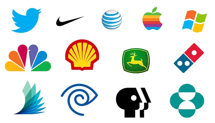
The practical test is the silhouette. Fill the mark in solid black with no colour, no gradient and no typography, and ask whether the shape is still yours. The Nike swoosh, the Apple bite and the Shell pecten survive this because the outline itself is ownable.
Distinctiveness also has a legal dimension that most business owners discover too late. Generic marks are hard to register as trademarks and hard to defend. A globe for a logistics company, a leaf for a wellness brand or a house outline for a real estate agency will sit in a category so crowded that a trademark examiner may refuse the application, and even if it registers, enforcing it against a similar mark is difficult. Distinctiveness is a commercial asset, not a style choice.
How to check it: print your logo alongside the eight closest competitors in your sector at the same size, in greyscale. If a stranger cannot pick yours out in three seconds, the mark is not distinctive enough.
What makes a logo memorable?
Recall comes from an ownable silhouette repeated consistently, not from detail. People store shapes and relationships, not fine elements. The working benchmark is whether a customer could roughly redraw your mark from memory after a handful of exposures. If what they draw is a generic square or circle, the mark is not being remembered as yours.
2. Simple: fewer decisions, faster recognition
Simplicity is the trait people misunderstand most often. It does not mean minimal or plain. It means the mark contains no element that is not doing a job.
Simple marks win for three measurable reasons. They are recalled and redrawn more accurately, which is the closest thing to a proxy for brand memory. They reproduce cleanly across embroidery, engraving, single colour print, vehicle wraps and screens. And they cost less to apply, because a complex mark forces you to maintain multiple versions for every context.
There is a failure mode on the other side. A mark can be so reduced that it becomes generic, which breaks trait one. The target is the smallest number of elements that still produces an ownable shape. We cover this tension in detail in our post on why simple logos outlast clever ones.
How many colours should a logo use?
One or two in the core mark, with a defined single colour version alongside it. Every extra colour raises print cost and cuts the number of contexts where the logo can be applied without modification. Colour should also never be the thing carrying recognition, because the mark will regularly appear in contexts where colour is stripped out: engraving, fax, single colour stamps, dark mode headers and embroidery on a coloured garment.
3. Scalable: it works at 16 pixels and on a building
Scalability is where the majority of amateur logos break. A mark that looks refined on a designer’s screen at 400 pixels wide often turns into grey mush as a browser favicon, an app icon or a 32 pixel avatar in an email client.
The modern logo has to survive a wider size range than at any point in design history. A single mark may need to appear as a 16 by 16 pixel favicon, a circular social profile crop, an app icon with rounded corners, a signature line in an email, a stitched patch on a uniform, and a printed sign several metres wide.
Practical requirements that follow from this:
- The mark must be built as vector artwork, not a raster image.
- Line weights must hold at small sizes. Hairlines disappear in print and in embroidery.
- Counters and gaps, meaning the enclosed spaces inside letters and shapes, must stay open. When they fill in, the mark reads as a blob.
- The design needs a simplified icon version for small applications, not just a shrunken version of the full lockup.
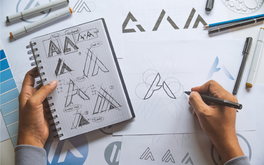
How to check it: export the logo at 16, 32 and 64 pixels wide. Look at it on a phone at arm’s length. If you cannot identify it at 32 pixels, you need a dedicated icon variant.
4. Appropriate: it matches the promise the business makes
Appropriateness means the mark’s visual language matches what the business actually sells and who it sells to. A children’s dental practice and a private equity firm should not be able to swap logos without anyone noticing.
This is where subjective taste causes the most damage. A founder who personally likes hand-drawn scripts may push for one on a cybersecurity brand, where the audience is reading for signals of rigour and reliability. The question is never “do I like this”, it is “does this move the audience toward the decision we want”.
Appropriateness is judged relative to the category. Some sectors carry strong visual conventions for a reason: financial services lean on stability cues, food brands on appetite and warmth, technical products on precision. You can deliberately break a convention to stand out, but that has to be a decision, not an accident. Breaking a category code works when the brand’s positioning also breaks the category code.
Does a logo need to show what the business does?
No, and most strong marks do not. Apple sells computers, Shell sells fuel, Nike sells sportswear, and none of those marks illustrate the product. A logo earns its meaning through repeated exposure rather than depiction. Literal illustration is useful mainly for young local businesses where a first-time customer needs to identify the category from a shopfront or a van, and even then it constrains you later: a pizza slice icon becomes a problem when the business moves into catering.
5. Durable: it survives longer than the trend that inspired it
A logo is the most expensive asset in a brand identity to change, because it appears on everything: signage, packaging, uniforms, documents, vehicles, apps and every historic piece of collateral. Design it for a ten year horizon.
Trends that have dated fast in the last two decades include heavy bevels and glossy reflections, extreme long shadows, the wave of near identical geometric sans serif rebrands, and gradient blobs. Each looked current at the time and each now timestamps a brand to a specific year.
Durability comes from grounding the mark in structure rather than surface. Proportion, balance, counter shapes and letterform relationships age well. Effects, textures and trend typefaces do not.
How long should a logo last before a redesign?
Plan for ten years or more, with small evolutionary refinements rather than replacements. Every full rebrand resets the recognition you have accumulated, and recognition is the entire asset. The brands that compound it over decades, like Coca-Cola, Shell and Volkswagen, adjust their marks in small increments and keep the underlying structure intact. If you find yourself considering a complete redesign every three years, the original mark was not durable and the next one probably will not be either unless the brief changes.
The five minute logo audit
Run these five tests on your current mark. Each one maps to a trait above.
- The squint test. Blur your eyes or apply a heavy blur filter. Does a clear, recognisable shape remain, or does it collapse into noise? Tests distinctiveness and simplicity.
- The black and white test. Remove all colour. A logo that only works in its brand colours will fail in fax, engraving, single colour print and dark mode. Tests simplicity.
- The 16 pixel test. Shrink it to favicon size. Tests scalability.
- The memory test. Show it to someone for five seconds, then ask them to draw it from memory. What they draw is what they actually retained. Tests distinctiveness and recall.
- The crowd test. Place it in a grid with competitor logos. Tests appropriateness and distinctiveness at the same time.
A mark that passes four of five is workable. A mark that fails the black and white test or the 16 pixel test needs structural revision, not a colour tweak.
A good logo is necessary, not sufficient
Passing all five traits gets you a mark that will not cost you money in reproduction or recognition. It does not, on its own, build a brand.
A logo is one asset inside an identity system, which includes your colour palette, typography, imagery and layout rules. That system sits inside the brand, which is the reputation your customers actually hold. Businesses that buy a logo and stop there end up with a good mark surrounded by inconsistent material, which undoes most of the benefit. The three layers are separated properly in logo vs brand identity vs brand.
If your current mark fails two or more of the five tests above, the fix is usually structural rather than cosmetic. Our team at Professional Logo Design builds marks against these five traits and delivers every logo as scalable vector artwork with the small size, single colour and reversed variants you will need. See our logo design services or browse the portfolio.
Written by the design team at Professional Logo Design. Brittany J. Content Strategist at Professional logo design